Labels
Any time you have a form element, it must have a label that describes its purpose. This includes text areas, input fields, check boxes, radio buttons, switches, and buttons.
Many apps will also request an accessible name used to describe the map or other data visualizations.
Label structure
A label consists of two parts: a visual indicator and a piece of text that programmatically communicates instruction to assistive technologies.
These parts may be presented through the same format, or they may be split into different components.
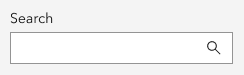
In the following example, an editable input field has a label of Search. This label is represented by text that is both visible and programmatically associated to the field in the code for assistive technologies.
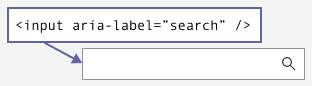
In the next example, the same editable field no longer has the word Search visible. Instead, the visible indicator is represented by the magnifying glass icon. But the programmatic label is still present in the code for assistive technologies.
Placeholder text
Placeholder text is not considered a label and cannot be used as a replacement. It can be used in addition to a label, but it is not advised for help text.
Help text that disappears as soon as a field has focus can be challenging for neurodivergent individuals or those with cognitive difficulties, as it requires memorization to complete the task. It is best to have persistent, visible help text, if the help text is critical to completing the task.
Buttons
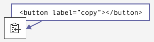
Buttons are form elements because they trigger an action. The text within a button is its label. If the button contains only an icon, text must be programmatically added to identify the button’s purpose to assistive technologies.
Note:
Icons inside of <calcite-button> or <calcite-action> are hidden from screen readers because the component should have a programmatic label. If the icon were labeled, screen readers would announce the label twice.
Related criteria
The Web Content Accessibility Guidelines tied to this topic are as follows: