Accessibility in visual hierarchy
Visual hierarchy is a design technique that uses contrast and visual variables to draw attention to key details and increase comprehension.
Visual variables include position, size, shape, value, color, and pattern, and should be selected by use case and maximum number of unique variables needed.
| Variable | Use case | Data type | Max count |
|---|---|---|---|
| Size | Order, sequential | Quantitative | 2-3 |
| Shape | Category, type | Qualitative | 2-4 |
| Color: Hue | Category, type | Qualitative | 2-7 |
| Color: Value | Order, sequential | Quantitative | 3-5 |
| Pattern | Category, type | Qualitative | 6-12 |
Size
Often used with point data, size may be proportional—useful for emphasizing magnitude differences within a dataset—or range graded. However, size assumes the target audience can determine the difference between scales.
Shape
Shapes can be geometric or pictorial. Shapes are commonly applied as point markers and work well with size when magnitude differences need display.
Basic geometric shapes include circles, squares, triangles, and pins. Basic shapes work best for dense data and highlighting type groupings. Pictorial symbols are better suited for unique features.
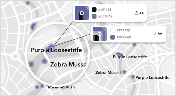
To reduce cognitive load and visual clutter, use a flat vector design style. Avoid fine details and keep shapes consistent in stroke and padding. Test shapes against different background areas to ensure the graphic meets a 3:1 contrast ratio for accessibility.
Hue
Hues are the wavelengths that make up the colors we see. They provide structure and readability when highlighting unique items or categories. Keep hues intuitive and limit them—research shows people struggle to distinguish visual differences beyond seven categories.
Color palettes
When selecting color palettes—also known as color ramps—cluster colors into red/orange, yellow/green, blue/purple, and ensure enough contrast between tones for the audience to distinguish categories.
To simulate color blindness in maps, consider tools such as Color Oracle or Color Brewer 2.0, or use an existing color-blind-friendly color ramp.

Value
Value refers to the lightness or darkness of a hue. Sequential color schemes displaying continuous information often rely on value. They vary brightness while keeping the hue constant, making patterns easier to interpret for trends or magnitude.
Because value relies on luminance, it also adapts to grayscale better than hue. This benefits individuals with color vision deficiencies who cannot see the full spectrum of color.
Pattern
Diagonal lines, dots, and crosshatching are all types of patterns. When applied to polygons, areas, and boundaries, patterns help differentiate unique items or categories. Using patterns for dual-encoding provides a secondary method of communicating information that is not exclusively dependent on color.
Related criteria
The Web Content Accessibility Guidelines tied to this topic are as follows: