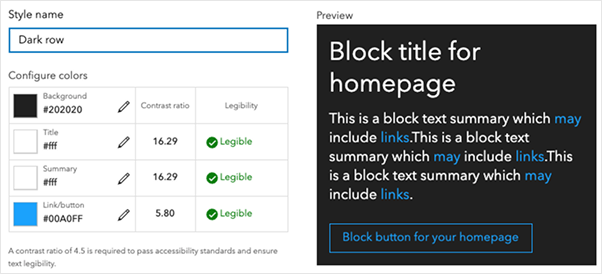
Manual color selection
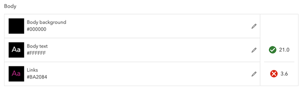
If customizing colors through individual selection, follow the 1.4.3 Contrast (Minimum) guideline. The contrast between text and background should be greater than or equal to a 3:1 ratio for large text and graphics, and 4.5:1 for regular text.
Large text: 14pt / 18px bold and above; 18pt / 24px normal weight and above
Regular text: everything else
Several online tools can help verify color contrast ratios:
ColorZilla is a Chrome and Firefox plug-in that can extract colors from a web page or screenshot.
For desktop tools:
Shared theme
For customers who already have an accessible theme or who want to set one at the organization level, ArcGIS Online and ArcGIS Enterprise allow you to set up a shared theme. This theme can then be inherited by other apps.
Related criteria
The Web Content Accessibility Guidelines tied to this topic are as follows: