ProGuide Custom toolbars for view panes
Language:      C#
Subject:       Framework
Contributor:   ArcGIS Pro SDK Team <arcgisprosdk@esri.com>
Organization:  Esri, https://www.esri.com
Date:          04/20/2026
ArcGIS Pro:    3.7
Visual Studio: 2026
This ProGuide explains how to create custom toolbars that can be added to custom Panes and to existing views in ArcGIS Pro. Custom toolbars are new at Pro 3.7.
In this topic
- Create a Custom toolbar
- Add Custom Toolbars to a Pane
- Add Custom Toolbars to an Existing Pane
- Adding Controls to Existing Custom Toolbars
Create a Custom toolbar
Starting at ArcGIS Pro 3.7, Custom toolbars can be added to Pro views (technically, Pro elements defined as "panes"). This can be existing views such as a Map View, or the Attribute table or a custom Pane created using ArcGIS Pro SDK. Custom toolbars should contain tools that are relevant to the view and related workflows.
Custom toolbars are defined within the new <customToolbars>...</customToolbars> section in the Config.daml. There is no code behind. Custom toolbars can include buttons, split buttons, tools, menus, button palettes, and so forth - much the same as a tab on the ribbon. Custom toolbars also come with a "built-in" UI customization experience which is described in the Pro help here: Customize toolbars on a view. The code snippet below illustrates how to define a custom toolbar:
<modules>
  <insertModule ...>
    <tabs>...
    </tabs>
    <controls>
      <button id="CustomToolbarsOnPanes_Button1Toolbar" ...>....</button>
      <button id="CustomToolbarsOnPanes_Button2Toolbar" ...>....</button>
      ....
   </controls>

   <customToolbars>
   <!-- custom toolbars must be declared within the "customToolbars" element -->
     <toolbar id="CustomToolbarsOnPanes_Toolbar1" caption="Custom Toolbar 1" >
       <button refID="CustomToolbarsOnPanes_Button1Toolbar" size="middle" />
       <button refID="CustomToolbarsOnPanes_Button2Toolbar" size="middle" />
       <button refID="CustomToolbarsOnPanes_Button3Toolbar" size="middle" />
       <button refID="CustomToolbarsOnPanes_Button4Toolbar" size="middle" />
       <splitButton refID="CustomToolbarsOnPanes_SplitButton1" />
     </toolbar>
   </customToolbars>
  </insertModule>
  ...
A custom toolbar can also display a menu with choices in a "burger button" format (same as a dockpane in this regard). This can be accomplished by using the extendedMenu attribute, with a value set to the id of a menu element as seen in the code snippet below. The menu element can contain a collection of controls such as buttons, checkboxes, etc.
 <modules>
  <insertModule ...>
     <customToolbars>
       <!-- The menu "customToolbar_BurgerMenu" set in the toolbar's extendedMenu attribute will
            be displayed on the toolbar as a 'burger button' -->
       <toolbar id="CustomToolbarsOnPanes_Toolbar1" caption="Custom Toolbar 1"
                extendedMenu="customToolbar_BurgerMenu">
        ...
       </toolbar>
     </customToolbars>
    ...
     <menus>
      <menu id="customToolbar_BurgerMenu" caption="Toolbar1 Menu">
         <button refID="CustomToolbarsOnPanes_Button7Toolbar"/>
         <button refID="CustomToolbarsOnPanes_Button8Toolbar"/>
         <checkBox refID="CustomToolbarsOnPanes_CheckBox"/>
      </menu>
     </menus>
Add Custom Toolbars to a Pane
Once defined, a custom toolbar reference can be added to a view/pane declaration within the Config.daml. The <pane...> element, starting at 3.7, can now contain a child <toolbars> element that contains the relevant custom toolbar reference or references (if you want to add more than one to a given pane). Adding multiple toolbars to a pane will 'stack' them on the view (see Stacking Custom Toolbars) below. The code snippet below shows adding a custom toolbar reference to a view/pane:
<modules>
<insertModule ...>
<customToolbars>
<toolbar id="CustomToolbarsOnPanes_Toolbar1" caption="Custom Toolbar 1" extendedMenu="...">
...
</toolbar>
</customToolbars>
...
<panes>
<!-- custom pane declared by the addin - note the child "toolbars\toolbar" element referencing
the custom toolbar -->
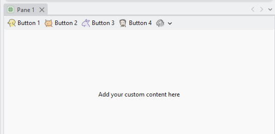
<pane id="CustomToolbarsOnPanes_Pane1" caption="Pane 1" className="Pane1ViewModel"
smallImage="GenericButtonGreen16" defaultTab="esri_mapping_homeTab"
defaultTool="esri_mapping_navigateTool">
<content className="Pane1View" />
<toolbars>
<toolbar refID="CustomToolbarsOnPanes_Toolbar1" />
</toolbars>
</pane>
</panes>
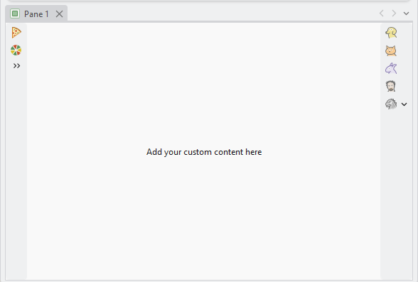
The screenshot below shows the resulting custom pane and its referenced custom toolbar (without and with a custom burger button menu - controlled by the toolbar extendedMenu="....." attribute value - if present):
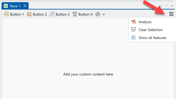
and the same custom toolbar with a Burger button menu via its extendedMenu="....." attribute value:
<insertModule ...>
  <customToolbars>
      <toolbar id="CustomToolbarsOnPanes_Toolbar1" caption="Custom Toolbar 1"
               extendedMenu="customToolbar_BurgerMenu">
        ...
      </toolbar>
   </customToolbars>
   ...
   <menus>
     <menu id="customToolbar_BurgerMenu" caption="Toolbar1 Menu">
        <button refID="..."/>
        <button refID="..."/>
        <button refID="..."/>
     </menu>
    </menus>

    <panes>
      <pane id="CustomToolbarsOnPanes_Pane1" caption="Pane 1" ...>
         <content className="Pane1View" />
         <toolbars>
            <toolbar refID="CustomToolbarsOnPanes_Toolbar1" />
         </toolbars>
      </pane>
    </panes>
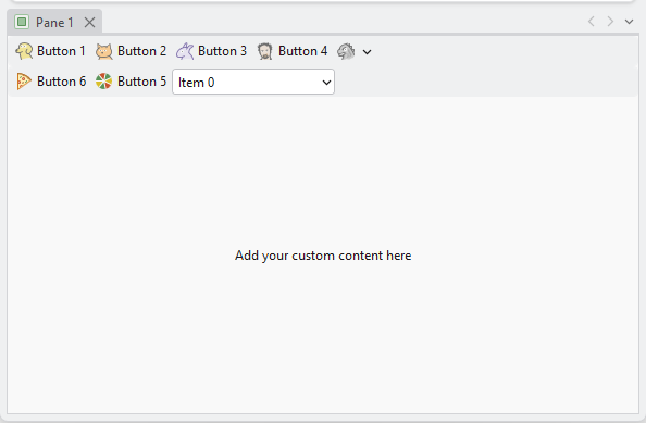
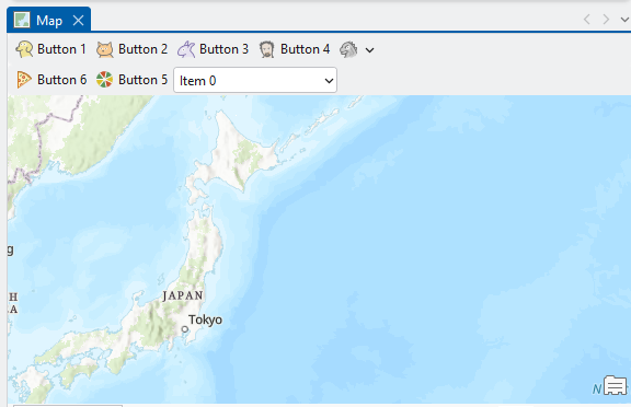
Stacking Custom Toolbars
When two or more custom toolbars are added to a pane, they will be 'stacked'. The following DAML snippet shows how a custom pane with two custom toolbar references - note how they are 'stacked' in the resulting pane UI (assuming they have the same 'docking' behavior defined):
<modules>
  <insertModule ...>
     <customToolbars>
       <toolbar id="CustomToolbarsOnPanes_Toolbar1" ...>...</toolbar>
       <toolbar id="CustomToolbarsOnPanes_Toolbar2" ...>...</toolbar>
       ...

    <panes>
       <pane id="CustomToolbarsOnPanes_Pane1" ...>
          <content className="Pane1View" />
          <!-- multiple toolbars will be 'stacked' -->
          <toolbars>
            <toolbar refID="CustomToolbarsOnPanes_Toolbar1" />
            <toolbar refID="CustomToolbarsOnPanes_Toolbar2" />
          </toolbars>
     </pane>
   </panes>
Docking Custom Toolbars
Toolbars can be docked to any of the four sides of the view - Left, Right, Top, Bottom. If no docking position is specified, custom toolbars will be docked along the top of the pane horizontally. As previously mentioned, two or more toolbars with the same docking position will be 'stacked' (whether vertically or horizontally). In this example, a pane references two custom toolbars. One docked to the left, and the other to the right:
<modules>
  <insertModule ...>
     <customToolbars>
       <toolbar id="CustomToolbarsOnPanes_Toolbar1" ...>...</toolbar>
       <toolbar id="CustomToolbarsOnPanes_Toolbar2" ...>...</toolbar>
       ...
   <panes>
    <pane id="CustomToolbarsOnPanes_Pane1" ...>
        <content className="Pane1View" />
        <toolbars>
            <toolbar refID="CustomToolbarsOnPanes_Toolbar1" dock="Right"/>
            <toolbar refID="CustomToolbarsOnPanes_Toolbar2" dock="Left" />
        </toolbars>
    </pane>
   </panes>
Add Custom Toolbars to an Existing Pane
Custom toolbars can be added to Pro's existing views/panes such as the mapview or layout. Use the <updatePane>...</updatePane> element to add new, or additional toolbars to the given pane. Note: Any "update" of an element defined in another module (other than the add-in making the update) must be placed within a parent updateModule element referencing the id of the module whose element(s) is/are being updated.
The DAML code snippet below illustrates the addition of two custom toolbars to the "standard" mapview pane. (Note the updateModule element referencing esri_mapping):
<modules>
  <insertModule ...>
     <customToolbars>
       <toolbar id="CustomToolbarsOnPanes_Toolbar1" ...>...</toolbar>
       <toolbar id="CustomToolbarsOnPanes_Toolbar2" ...>...</toolbar>
     </customToolbars>
    ....
 </insertModule>
 <updateModule refID="esri_mapping">
   <panes>
     <!-- custom toolbars being added to the mapview -->
      <updatePane refID="esri_mapping_mapPane">
        <toolbars>
          <insertToolbar refID="CustomToolbarsOnPanes_Toolbar1" />
          <insertToolbar refID="CustomToolbarsOnPanes_Toolbar2"  />
        </toolbars>
      </updatePane>
    </panes>
</updateModule>
Adding Controls to Existing Custom Toolbars
At 3.7, the following custom toolbars, known as "system toolbars" from the standpoint of the the Pro's UI, are currently defined in the application. These existing custom toolbars (aka "system" toolbars) are found on the Pro editor attribute table view and some of the knowledge graph views. "System" toolbars, as well as any custom toolbar defined in an add-in, can be customized via a built-in UI experience as documented in the Pro Application help topic Customize toolbars on a view. Custom toolbars can also be modified in the daml, same as any other daml element, using <updateToolbar ...>....</updateToolbar> to add additional button, tools, menus and so forth. However, Pro custom toolbars cannot be deleted.
The following custom toolbars that are defined in ArcGIS Pro:
| Module | Custom Toolbar |
|---|---|
| esri_editing_EditingModule | esri_editing_tableToolbar |
| esri_editing_EditingModule | esri_editing_externalTableToolbar |
| esri_knowledgeGraph_module | esri_knowledgeGraph_dataModelDesignerToolbar |
| esri_knowledgeGraph_module | esri_knowledgeGraph_centralityToolbar |
| esri_knowledgeGraph_module | esri_knowledgeGraph_communityToolbar |
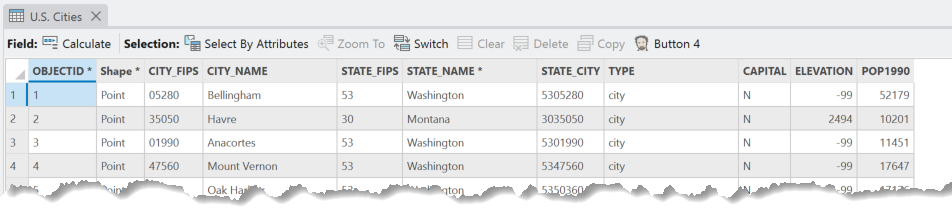
Here is a code snippet that shows modifying the custom toolbar referenced on the Editing module's attribute pane. A custom tool is being added to the toolbar and the "Add Field" button is being removed.
 <modules>
   <insertModule ...>
      <tabs>...
      </tabs>
      <controls>
         <button id="CustomToolbarsOnPanes_Button4Toolbar" caption="Button 4" ...>....</button>
         ....
       </controls>
       ...
    </insertModule>

    <updateModule refID="esri_editing_EditingModule">
       <customToolbars>
          <updateToolbar refID="esri_editing_tableToolbar">
             <insertButton refID="CustomToolbarsOnPanes_Button4Toolbar" size="middle" groupName="Add-Ons" />
             <updateButton refID="esri_editing_table_tableAddFieldButton" isVisible="false" />
           </updateToolbar>
         </customToolbars>
    </updateModule>
Here is the resulting "customization" shown on the editing toolbar on the attribute pane: