Using default themes
Esri applications built using the Calcite Design System’s light or dark modes will have an accessible theme by default. Most applications also provide options to customize color choices, either through accessible themes or manual color selection.
High-contrast modes
Accessibility guidelines stipulate minimum color contrast ratios, but these may not be sufficient for individuals with low vision or certain types of color vision deficiencies. High-contrast modes reduce the number of colors used within an application, often removing gradients and background images. High-contrast modes are controlled at the operating system level.
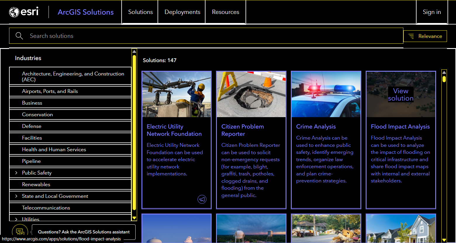
Windows
Windows 11 includes multiple predefined high-contrast themes and the ability to craft one based on your own color preferences. Windows high-contrast mode also disables background images.
Mac OS
Mac OS display settings support inverted colors, increased contrast through border strokes, reduced transparency, and the ability to filter out specific colors involved in vision deficiencies in the display.
iOS
iPhone and iPad support inverted colors, reduced transparency, and adjusting individual display colors to account for color vision deficiencies.
Android
Android supports inverted colors and individual color corrections—suggested for individuals with color vision deficiencies. High-contrast themes, reduced transparency, and high-contrast text may also be available within the accessibility settings, but labelling varies by phone manufacturer.
Related criteria
The Web Content Accessibility Guidelines tied to this topic are as follows: