Bar chart
Bar charts summarize and compare categorical data using proportional bar lengths to represent values.
Bar charts are composed of an x-axis and a y-axis. The x-axis represents discrete categories that correspond to one or many bars. Each bar’s height corresponds to a numeric value, which is measured by the y-axis.
Variables
Bar charts display unique category values from a Category or Date field as bars along the x-axis. The height of the bars corresponds to raw or aggregated numeric values.
If the values in the category variable are unique (only appear in the attribute field once), no aggregation is necessary, but a numeric field must be specified. For example, if the category variable is StateName and the table only has one record for each state, the bar heights are determined by the numeric field, and no aggregation is needed.
If the category values repeat in the table, an Aggregation method must be chosen to specify how the data will be summarized. For example, if the category variable is StateName for a county dataset, each state name appears in the table multiple times, so aggregation is necessary to show summarized amounts per state.
If no numeric fields are specified, the chart uses the Count aggregation method, which totals the number of times each unique category appears in the category field. For example, the category variable is set to StateName for a county dataset with the Count aggregation method. The resulting chart will display one bar for each state, and the bar heights will represent how many counties belong to each state.
If numeric fields are specified, the aggregation method can be one of the following:
Sum
Mean
Median
Minimum
Maximum
To view null values on a chart, turn on the Treat null as category toggle button. If null values exist, this toggle button will show an additional bar that summarizes null values. Use the Null category label text input to change the label for the null bar. Use the Null color color swatch on the Series tab to change the color of the null bar.
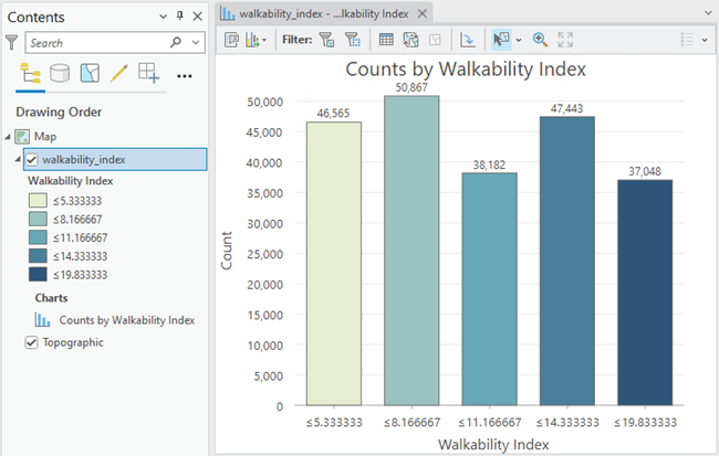
When a layer's Primary symbology option is set to Graduated Colors or Unique Values, a bar chart can be configured to match the layer symbology.
Multiple series
More than one numeric value, or series, can be displayed for each discrete category value on the x-axis. Multiple series bar charts can be created by adding multiple numeric fields, or by setting a Split by category field.
When multiple numeric fields are added, one bar is drawn for each field at each category value on the x-axis. For example, the category variable is set to StateName for a county dataset with the Sum value for the Aggregation method and two numeric fields, Population2010 and Population2015. The resulting chart will display two bars for each state; one bar will represent the sum of all the Population2010 values for each county in the state, and the second will represent the sum of all the Population2015 values for each county in the state.
Each category in a bar chart can also be split into multiple series by another category field's values. For example, the category variable is set to StateName for a county dataset with the Count value for the Aggregation method and the ElectionWinner value for the Split by category field. The Series table populates with each unique ElectionWinner value, and the resulting chart will display three bars for each state with heights corresponding to the number of counties that fell into each Split by category: Democrat, Republican, and Independent.
Note:
A Split by category field cannot be applied when more than one numeric field has been added.
Note:
Category fields with many unique values are not appropriate for splitting a field into multiple series.
Display multiple series
Use the Display multiple series as option on the Series tab to choose how series are compared.
Side-by-side—Series are placed next to each other at each category. This option is best for comparing individual values across series.
Stacked—Series are stacked to show how each series contributes to the total at each position along the x-axis. This option is best to understand the overall total and how each series contributes.
100% Stacked—Series are stacked so that the total for each category equals 100 percent, emphasizing the part-to-whole relationship between series. This option is best for comparing the relative proportions of each series, rather than absolute values.
Grid—Each series is shown in a separate mini chart. This option is best for comparing patterns and trends across series without overlap. You can control the layout using the Mini charts per row input and explore individual charts by turning on the Show preview chart check box.
Time binning options
When a date field is used for the Category or Date field, time binning options can be configured by turning on the Enable temporal binning toggle button. When temporal binning is enabled, the options described in the subsections below control the interval size and related settings applied to the binning.
Interval size
Temporal data is binned into time intervals. The default interval size is based on the temporal extent of the dataset and can be manually changed using the Interval size option.
Empty bins
Depending on the sparsity of the dataset and the time interval size specified for binning, there may be bins that contain no data. Empty bins may be treated as zero when a lack of data truly represents a value of zero. For example, no illnesses were reported in May or no rain was collected during a week span. It is not appropriate to assign a zero value to a bin when no data exists because none was collected. For example, no reading from a temperature gauge does not mean there was a temperature of zero.
The following are the options for handling empty bins:
Treat as zero—Empty bins are displayed with a zero value.
Treat as null—Empty bins are not displayed.
Interval alignment
Time intervals can align to the first data point, the last data point, or a specific reference time.
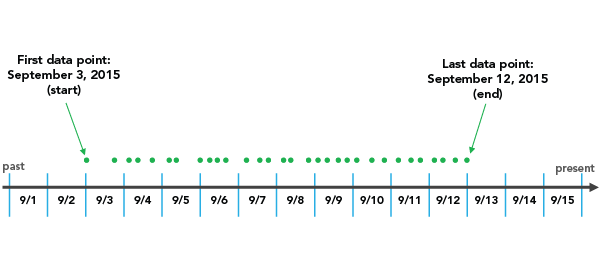
The Snap to first data point option initiates binning with the earliest date and works forward.
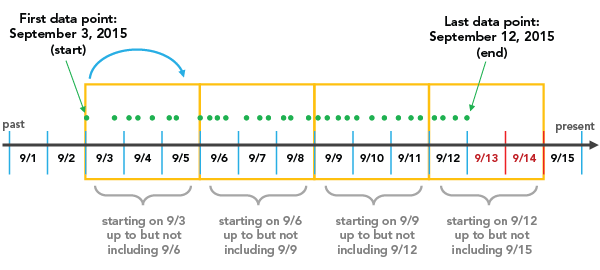
The Snap to last data point option initiates binning with the most recent date and works backward.
The Reference time option initiates binning on a specific, user-defined date.
Interval alignment is important to consider because, depending on the configuration, partially empty bins may be created. Partially empty bins can give the misleading impression that there is a dip in the value or count during that time, when really the data collection began or ended during the span of that bin. To avoid bin bias, check the Trim incomplete interval option. This removes the partially filled bin from the visualization.
Moving average
If you are using a date field to create the chart, you can add a moving average. Analysis of temporal data can be problematic due to inconsistent or unreliable data collection. In these cases, it can be helpful to apply a moving average to smooth the noise and obtain a clearer picture of the overall trend. When you check the Show moving average check box, a line is overlaid on the bar chart that represents the average value of the previous n periods, specified in the Moving average period control.
Note:
Moving average is only available for single-series temporal charts.
Match layer symbology
When a layer uses the Graduated Colors or Unique Values symbology options, you can choose the <Match Layer Symbology> option from the Category or Date drop-down menu to use the bar chart to display the categories defined by the symbology classes. Colors and labels from symbology classes will also be reflected in the bars. This view allows you to explore the distribution of the symbology classes and interact with the data according to symbology classes—for example, to select all features that belong to a certain class.
Axes
The options described in the subsections below control the axes and related settings.
X-axis label character limit
Category labels are truncated at 11 characters by default. When labels are truncated, the full text is available by hovering over the label. To display the entire label text in the chart, increase the label character limit.
Y-axis bounds
Default y-axis bounds are based on the range of data values represented on the y-axis. You can customize these values by providing a new axis bound value. You can set a y-axis bound to keep the scale of the chart consistent for comparison. Click the reset button to revert the axis bound to the default value.
Note:
Since bar charts use length to represent relative value, it is important that all bar charts include an origin of zero.
Adaptive axis bounds
When a multiseries bar chart is displayed with the Grid option, the axis bounds can be configured with the following options:
When applied to the y-axis, the following options can be used:
Fixed—Applies the global minimum and maximum bounds to all mini charts.
Adaptive—Adjusts to the local minimum and maximum bounds for each mini chart.
When applied to the x-axis, the following options can be used:
Fixed—Each mini chart will include all categories that are present in the
Category or Datefield, regardless of whether the series contains records for that category.Adaptive—Allows the x-axis for each mini chart to adjust to only display those categories that have data.
Grid intervals
Configure grid intervals for the y-axis using the Interval control. The default grid interval will be calculated automatically.
Label orientation
Axis labels can be configured to display with one of the following orientations: Auto, Horizontal, Diagonal, or Vertical.
Date format
You can format the way an axis displays dates by specifying a pre-defined option or defining a custom format string. For example, you can use M/yy as a custom format string to display dates in a numeric month-year format.
Learn more about date formatting
Number format
You can format the way an axis displays numeric values by specifying a number format category or defining a custom format string. For example, you can use $#,### as a custom format string to display currency values.
Learn more about numeric formatting
Appearance
The options described in the subsections below control the chart appearance and related settings.
Titles and description
The charts and axes default titles are based on the variable names and chart type. These can be edited on the General tab in the Chart Properties pane. You can also provide a value for the Description option, which is a block of text that appears at the bottom of the chart window.
Visual formatting
You can configure the look of a chart by formatting text and symbol elements, or by applying a chart theme. Format properties can be configured on the Format tab in the Chart Properties pane. A chart theme can be selected on the Chart tab. Chart formatting options include the following:
Size, color, and style of the font used for axis titles, axis labels, description text, legend title, legend text, and guide labels
Color, width, and line type for grid and axis lines
Background color of the chart
Learn more about changing a chart's appearance
Series style
Bar charts with no aggregation or grouping will match the colors defined in the layer symbology by default. Once an aggregation or grouping is applied, you cannot use the layer symbology colors; a color scheme is applied. You can change colors on the Series tab in the Chart Properties pane by clicking the Symbol color patch in the Series table and choosing a new color. Alternatively, use the Color scheme drop-down list on the Series tab to apply a palette to the series in a chart.

To apply a common style to multiple series, select multiple rows in the Series table, and click the Symbol color patch for one of the selected series.
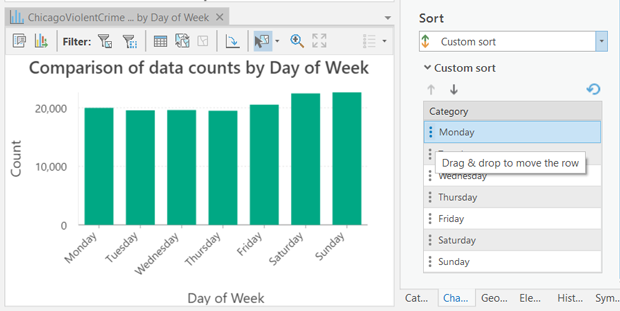
Sort
Bar charts are automatically sorted alphabetically by their categories (x-axis ascending). You can change this using the Sort options in the Chart Properties pane. The following sort options are available for bar charts:
X-axis Ascending—Categories are arranged alphabetically from left to right.
X-axis Descending—Categories are arranged in reverse alphabetical order.
Y-axis Ascending—Categories are arranged by their value (bar height), from smallest to largest.
Y-axis Descending—Categories are arranged by their value (bar height), from largest to smallest.
Custom—Categories can be arranged manually in the Custom sort table. For example, the following image shows a custom sort order of weekdays in their natural order:
Data labels
Labels displaying the value of each bar or series can be turned on by checking Label bars on the Data tab in the Chart Properties pane. Additional series-level style options can be configured on the Series tab by clicking the text patch in the Data Labels column of the Series table.
Orientation
Bars can be drawn horizontally by clicking the Rotate chart button  in the chart window.
Guides
Guide lines or ranges can be added to charts as a reference or way to highlight significant values. To add a new guide, go to the Guides tab in the Chart Properties pane, click the arrow on the Add guide button, and select one of the following options:
Create fixed value line or range guide—Draw a line or range guide at a fixed location. When this option is selected, provide a value for Value where you want the line to draw. To create a range, provide a to value.
Create data-driven guide—Draw a data-driven guide. When this option is selected, use the Value drop-down list to a select a field whose values will be used to calculate the location of the guide. Select an aggregation option to specify how these values are summarized.
The guide style can be configured using the Line style or Fill color style picker, depending on the guide type. Optionally, add text to the guide by specifying a Label value, and configure the label style by clicking the text swatch adjacent to the input to open the style picker. Data-driven guides always display the guide value (based on the field values and aggregation), and this value will be appended to the end of any text provided for the Label value.
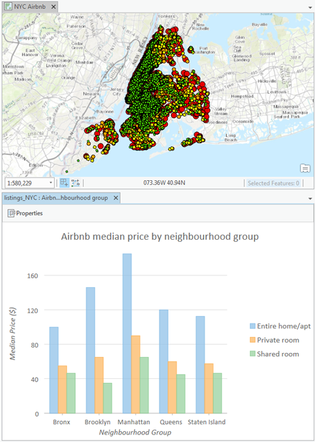
Example
Create a bar chart to compare median vacation rental prices across neighborhoods in New York City by room type using the following settings:
Category or Date—
NeighborhoodAggregation—Median
Numeric field—
PriceSplit by—
Room type