How Evaluate Variable Influence for Predictions works
The Evaluate Variable Influence for Predictions tool evaluates how explanatory variables affect predicted values in spatial statistics model (.ssm) files created by the Forest-based and Boosted Classification and Regression tool. You must provide input features that containing the same explanatory variables that were used to train the input model file, along with matching explanatory variable fields, distance features, and explanatory rasters. The tool will create an output table containing charts and values displaying which variables affected the predicted values and the shape of the relationship.
Traditional regression models like ordinary least-squares (OLS) or logistic regression explain variable influence through coefficients. For example, the coefficients of OLS indicate how much the predictions increase or decrease when a particular explanatory variable increases, and the coefficients of logistic regression indicate how the odds ratio changes when predicting categories. However, machine learning models are typically nonlinear and do not have simple coefficients that explain how predictions change for different values of explanatory variables. A common approach to visualizing the influence of each explanatory variable on predicted values is to use partial dependence plots.
Partial dependence plots
Partial dependence plots show how the predictions change on average for various values of each explanatory variable, keeping all other explanatory variable values fixed. For example, in OLS, partial dependence plots form a straight line with the slope equal to the coefficient. However, for machine learning models, the relationships are nonlinear, so the predictions may increase for some ranges of the explanatory variable, decrease for others, or form other more complex curves.
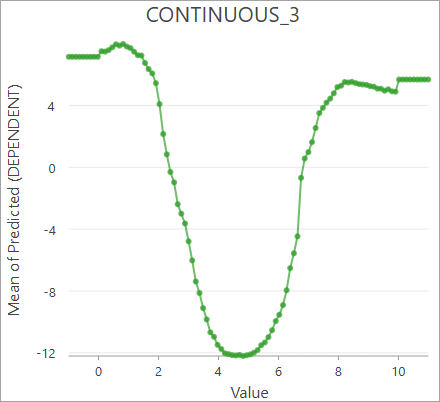
For example, the plot below shows how a dependent variable responds to different values of an explanatory variable. Large and small values of the explanatory variable result in larger predicted values on average, but values in the middle result in lower predicted values.
Note:
The partial dependence plot for an explanatory variable is constructed by predicting with various values of the explanatory variable and keeping all other explanatory variables equal to their original values. For each tested value, predictions are calculated for each input feature and then averaged. The averages are then plotted against the tested values of the explanatory variable.
Continuous explanatory variables
The Partial Response of Continuous Variables chart displays the partial dependence plots for each continuous explanatory variable. The values of the explanatory variable are displayed on the x-axis, and the average predicted values are displayed on the y-axis.
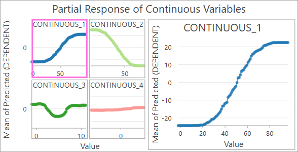
Each continuous explanatory variable is displayed in a grid on the left, and you can click each variable to display the individual chart on the right. The plots in the grid share the same scale of the y-axis to make their effects easier to compare.
Categorical explanatory variables
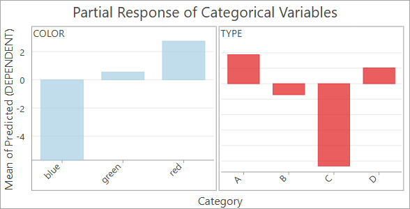
The Partial Response of Categorical Variables chart displays the partial dependence plots for each categorical explanatory variable. The x-axis displays each category of the categorical variable and the average predicted values on the y-axis.
For example, the following image shows the partial dependence plots for two categorical explanatory variables: color and type. For the color variable, blue results in lower predicted value; red results in larger predicted values; and green results in slightly larger values. Similarly, type C results in lower predicted values, and types A and D result in larger predicted values.
Categorical dependent variables
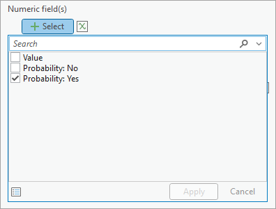
When the dependent variable is categorical (a classification model), partial dependence plots show how each variable affects the probability of classifying each category. By default, the y-axis of each chart will display the average probability of the feature being classified into the first category, but you can change the category displayed by the chart in the Chart Properties pane. In the Data tab, press the Select button under Numeric field(s), and choose the category to display. Only enable one category at a time for the chart to correctly display the partial dependence plot.
Best practices and limitations
The following are best practices and limitations when using this tool:
- Partial dependence plots assume that each explanatory variable is independent. Partial dependence plots show the effect of each explanatory variable in isolation, but if multiple variables are correlated and share mutual information, the plots cannot separate their individual influence. This is analogous to multicollinearity in traditional regression.