Chart
汇总
Chart 类用于定义 ArcGIS Pro 图表。 该类用于创建各种 类型的图表 ,包括条形图、折线图、散点图、散点图矩阵、QQ 图、直方图、箱形图和数据时钟。 也可以使用该类来定义图表标题、轴线以及其他属性。
旧版本:
Chart 类是 arcpy.charts 模块中其他子类的父类。 这些子类被设计为 Chart 类的更方便、更直观的替代项。 从 ArcGIS Pro 2.9 开始, Chart 类已弃用,并且不会针对新功能进行更新。 建议您改用 arcpy.charts 模块中的子类。
讨论
可借助图表以直观的方式呈现地图要素的相关信息以及它们之间的关系。 也可以为非空间表格创建图表,并且可以通过图表显示地图中要素的附加信息或以另一种不同的方式显示这些信息。 图表与地图是相辅相成的,因为图表直观地传达了通常以数字形式汇总或从表格中发掘的信息。 通过图表可以快速比较各要素,从而深入了解各要素之间的函数关系,由此以可视化方法显示其他方式难以呈现的数据分布、趋势和模式。
图表可以通过 Chart 对象创建,并可添加到 ArcGIS Pro 工程中的图层或表格。 要将图表添加到工程中的图层,请创建一个 Chart 对象,配置其属性并将其与 arcpy.mp.ArcGISProject 中具有 arcpy.mp.Layer 的对象 Chart 相关联。 当工程已在 ArcGIS Pro 中打开时,通过以上方式创建的图表可以从 内容 窗格中图层下的 图表 部分打开。
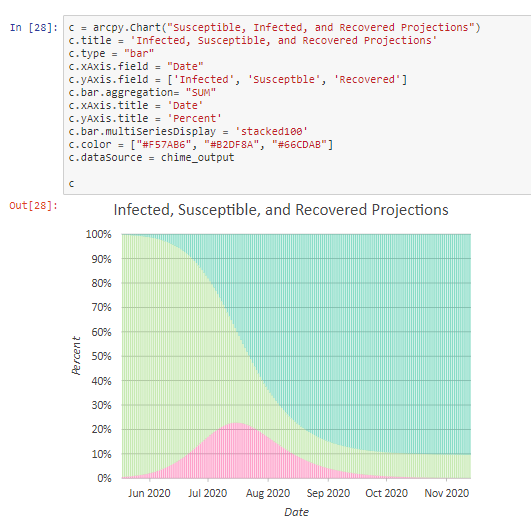
Chart 对象具有 dataSource 属性,此属性可用于为数据源创建包括各种要素类、表格格式以及 Web 图层(要素服务)的图表。 图表可以导出为 .svg 文件,以便进行可视化。 Chart 对象支持 Notebook 中丰富的表示形式,且可通过图形化方式显示。
语法
Chart(name)
| 名称 | 说明 | 数据类型 |
|---|---|---|
|
name |
The name of the chart. A chart must have a unique name per layer. This name is only used for identification; it is not displayed. |
String |
属性
| 名称 | 说明 | 数据类型 |
|---|---|---|
|
bar (读取和写入) |
设置适用于 条形图 的附加属性。
|
Object |
|
boxPlot (读取和写入) |
设置适用于 箱形图 的附加属性。
|
Object |
|
calendarHeatChart (读取和写入) |
设置适用于 日历热点图 的附加属性。
|
Object |
|
dataClock (读取和写入) |
设置适用于 数据时钟 的附加属性。
|
Object |
|
dataSource (读取和写入) |
设置图表的数据源。 当通过 |
String |
|
description (读取和写入) |
设置图表描述。 该描述文本会显示于图表视图底部。 |
String |
|
displaySize (读取和写入) |
当使用 |
List |
|
histogram (读取和写入) |
设置适用于 直方图 的附加属性。
|
Object |
|
legend (读取和写入) |
设置图表图例的属性。
|
Object |
|
line (读取和写入) |
设置适用于 折线图 的附加属性。
|
Object |
|
matrixHeatChart (读取和写入) |
设置适用于 矩阵热点图 的附加属性。
|
Object |
|
qqPlot (读取和写入) |
设置适用于 QQ 图 的附加属性。
|
Object |
|
scatter (读取和写入) |
设置适用于 散点图 的附加属性。 |
Object |
|
scatterMatrix (读取和写入) |
设置适用于 散点图矩阵 的附加属性。
|
Object |
|
title (读取和写入) |
设置图表的标题。 标题文本显示于图表视图顶部,并用作 内容 窗格中 按绘制顺序列出 选项卡 |
String |
|
type (读取和写入) |
设置所要创建图表的类型。 其中包括以下有效选项:
|
String |
|
xAxis (读取和写入) |
设置 x 轴的属性。
|
Object |
|
yAxis (读取和写入) |
设置 y 轴的属性。
|
Object |
 的标注。
的标注。方法
addToLayer(layer_or_layerfile)
addToLayer 方法可将图表对象添加到图层或表视图。
| 名称 | 说明 | 数据类型 |
|---|---|---|
|
layer_or_layerfile |
The chart will be added to the target object. This argument can be a |
Object |
将图表添加到现有图层。
import arcpy

# Insert creation of chart object here
# ...

aprx = arcpy.mp.ArcGISProject("current")
map = aprx.listMaps()[0]
censusLayer = map.listLayers('Census Block Groups')[0]

# Add chart object to a layer
chart.addToLayer(censusLayer)
exportToSVG(path, width, height)
exportToSVG 方法可将图表导出为 SVG 格式。
| 名称 | 说明 | 数据类型 |
|---|---|---|
|
path |
将图表以 SVG 格式导出时的路径。 |
String |
|
width |
输出图形的宽度。 |
Integer |
|
height |
输出图形的高度。 |
Integer |
将具有工程图层数据源的图表导出到 .svg 文件中。
import arcpy

# Insert creation of chart object here
# ...

aprx = arcpy.mp.ArcGISProject('current')
censusLayer = aprx.listMaps()[0].listLayers('Census Block Groups')[0]

# Set data source of chart object to a layer in current project
chart.dataSource = censusLayer

# Save the chart to file with dimensions width=500, height=500
chart.exportToSVG('populationByState.svg', 500, 500)
updateChart()
该 updateChart 方法可更新图表属性,以同步对象与之前添加到图层的图表之间的更改。
可以使用 updateChart 方法将图表属性更改同步到图层中。
import arcpy

# Insert creation of chart object here
# ...

chart.addToLayer(myLayer)

# Further modification is necessary
chart.description = "Data from the U.S. Census Bureau"
chart.updateChart()
代码示例
要将图表添加到图层,可以将 Chart 对象添加到 arcpy.mp Layer 对象。
import arcpy

aprx = arcpy.mp.ArcGISProject("current")
map = aprx.listMaps()[0]
censusLayer = map.listLayers('Census Block Groups')[0]
chart = arcpy.Chart('MyChart')

chart.type = 'scatter'
chart.title = 'Relationship between Percent Vacant (Housing) and Population Density'
chart.description = 'This chart examines the relationship between housing vacancy and population density.'
chart.xAxis.field = 'Per_Vacant'
chart.yAxis.field = 'Pop_Density'
chart.xAxis.title = 'Vacant Housing %'
chart.yAxis.title = 'Population Density (per Sq. Mile)'
chart.addToLayer(censusLayer)
根据列表中的值来创建和导出图表。 该示例演示了如何将列表作为 CSV 文件写入磁盘,以便随后通过设置 dataSource 属性将该文件用于创建图表。
import arcpy
import csv

temp_csv_file = r'c:\temp\data.csv'
out_svg_file = r'c:\temp\chart.svg'
# Data for automobile miles per gallon (MPG) and horsepower
columns = ['mpg', 'horsepower']
data = [
    [18, 130],
    [15, 165],
    [26, 113],
    [18, 150],
    [28, 90],
    [32, 61],
    [16, 150],
    [17, 140]
]

# Write this list to a .csv file
with open(temp_csv_file, 'w', newline='') as csvfile:
    writer = csv.writer(csvfile, delimiter=',')

    # Write column headers
    writer.writerow(columns)

    # Write data rows
    writer.writerows(data)

chart = arcpy.Chart('MyChart')
chart.type = 'scatter'
chart.title = 'Relationship between MPG and Horsepower'
chart.xAxis.field = 'mpg'
chart.yAxis.field = 'horsepower'
chart.dataSource = temp_csv_file
chart.exportToSVG(out_svg_file, width=750, height=400)